How to Build a Project Management Dashboard in 7 Easy Steps
- What is a Project Management Dashboard?
- Core Benefits of Using Project Dashboards
- How to Build a Project Management Dashboard? 7 Quick Steps
- Project Management Dashboard Examples with Templates
- 5 Best Project Management Dashboard Tools
- Common Project Management Dashboard Pitfalls to Avoid
- Manage Projects Effectively with the Right Dashboard
- FAQs about Project Management Dashboard

Key Highlights:
- A project management dashboard gives real-time insights into project progress, team capacity and profitability. Thus, helping teams make smarter decisions.
- It ensures accurate billing based on tracked time and agreements, streamlining financial processes for teams.
- The dedicated client portal keeps clients informed with project updates and deliverables, reducing the need for constant status reports.
Juggling multiple projects while keeping stakeholders informed can feel like spinning plates during an earthquake.
A project management dashboard transforms complex project data into intuitive visualizations that reveal progress, problems, and possibilities at a glance. This central command center eliminates information fog as well as replaces it with crystal-clear insights.
Teams identify issues before they become crises, leaders allocate resources more effectively and clients gain confidence through unprecedented transparency, all while reducing administrative reporting burdens.
What is a Project Management Dashboard?
A project management dashboard is a centralized visual interface that consolidates key project data and metrics in real-time. It provides teams and stakeholders with a comprehensive project status dashboard that highlights progress against goals. This visual command center allows professionals to track multiple workstreams while identifying potential issues before they become problems.
A project management dashboard pulls data from various sources and transforms it into visual representations such as graphs as well as charts. The system continuously updates as team members complete tasks or log information, creating a living document that reflects current project reality. Most dashboards allow users to customize views based on their specific needs or roles.
Key objectives:
- Improve decision-making by providing immediate access to critical project information without the need for meetings or lengthy reports.
- Enhance transparency across teams by creating a single source of truth that aligns everyone’s understanding of project status and priorities.
- Identify potential bottlenecks and risks early through visual indicators that highlight deviations from planned timelines or budgets.
- Optimize resource allocation by displaying current workloads and availability across team members as well as departments.
- Facilitate accountability by clearly showing task ownership and progress tracking that connects individual contributions to overall project success.
Core Benefits of Using Project Dashboards
Successful project delivery requires clear visibility and efficient resource management. Project management dashboards offer significant advantages for agencies working with multiple clients and complex deliverables.
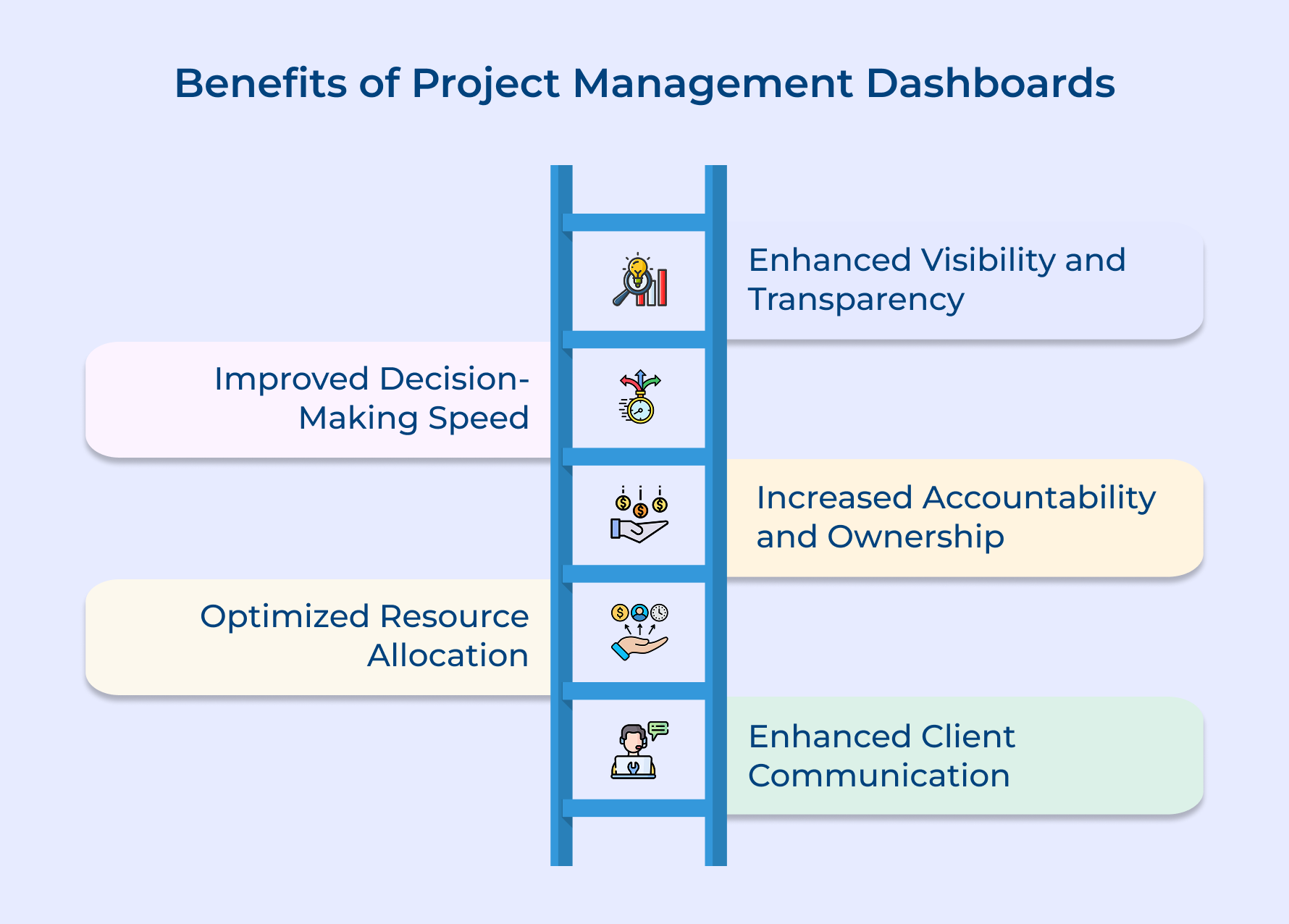
1. Enhanced Visibility and Transparency
A project dashboard shows all your active projects in one place. Teams can quickly check progress and key metrics without searching through emails or files. This keeps everyone on the same page and builds trust with clients who can also view the dashboard.
2. Improved Decision-Making Speed
Real-time data helps you make smart decisions quickly. The dashboard uses visual cues to point out problems early, so you can fix them before they grow. This saves time and helps leaders manage resources better.
3. Increased Accountability and Ownership
Dashboards show who is responsible for each task and how much has been completed. This encourages team members to take ownership of their work and stay on track with deadlines as well as quality goals.
4. Optimized Resource Allocation
You can easily see how busy each team member is. This helps managers shift work from overloaded staff to those with more capacity. It keeps teams balanced and prevents burnout while meeting deadlines.
5. Enhanced Client Communication
Clients can check project updates through the dashboard instead of asking for reports. This keeps them informed and reduces the need for frequent calls or meetings. It also strengthens client trust and saves your team time.
How to Build a Project Management Dashboard? 7 Quick Steps
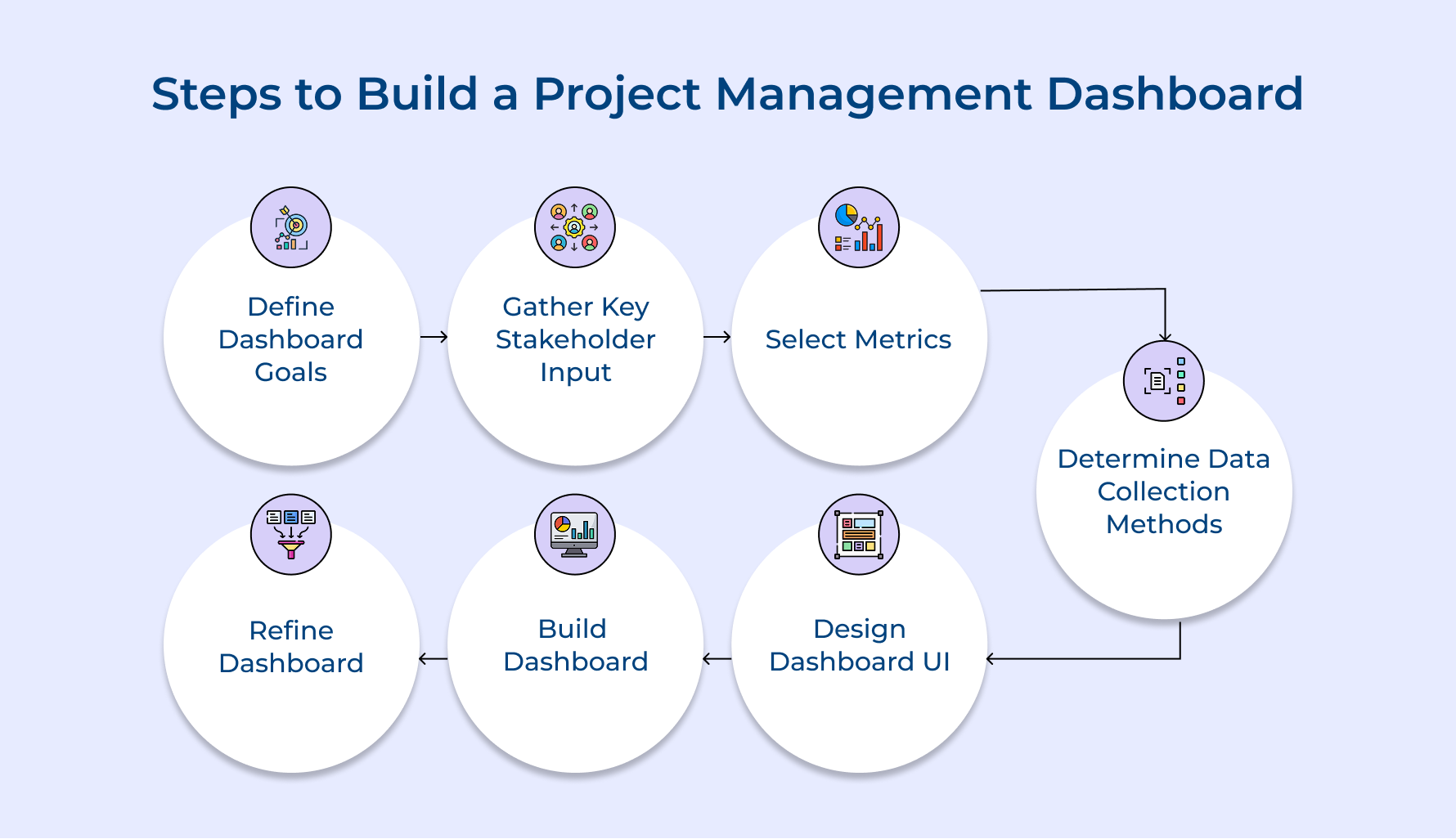
Let’s explore the seven crucial steps to build a dashboard that effectively supports your project management journey.
1. Define Clear Dashboard Goals First
Setting clear goals is the first and most important step in building a useful dashboard. It helps you stay focused on solving real problems and avoid ending up with a cluttered screen full of random charts. Here are some common goals agencies often set:
- Client transparency: Show real-time project status, including milestones and next steps, so clients don’t need constant updates.
- Resource management: Track team workloads to spot who’s overloaded or underused, and shift tasks before burnout hits.
- Financial tracking: Compare project budgets to actual costs, and watch profit margins in real time to catch issues early.
- Risk management: Get alerts for tight deadlines or changing project scopes so you can act before things go off track.
For instance, a marketing agency might focus on campaign KPIs like conversions as well as engagement—keeping the dashboard useful and to the point.
2. Gather Key Clients Input Upfront
Getting client input early in the dashboard process helps you build something they’ll actually use, not just what you think they want. Involving them early builds trust and ensures the dashboard supports transparency as well as stronger relationships.
Start by having structured interviews or casual chats with key clients. Ask what frustrates them about current reports and what info would help them feel more in control of project progress. One-on-one meetings or small focus groups work well for open, honest feedback.
Pro tips:
- Show a rough draft: Create a basic sketch or wireframe of the dashboard. It helps clients picture what’s possible and give clearer feedback.
- Talk about goals, not just data: Ask what decisions they need to make, not just what numbers they want to see. This keeps the focus on delivering insights.
3. Select Critical Metrics To Display
Choosing the right metrics is key to building a dashboard that’s actually helpful. The goal is to track what really matters, so you can make smart decisions without getting overwhelmed.
Here are a few questions to ask when picking metrics:
- Does this connect to the problems we’re trying to solve?
- Will it help us act now, or just look back later?
- Can our team or clients do something about it?
- How often should it be updated to stay useful?
For example, a consulting firm might focus on utilization rate (the percentage of billable hours vs. total hours) to quickly see if the team is working efficiently or has extra capacity.
Other helpful metrics for professional services include:
- Budget performance index (BPI): Shows if projects are going over budget.
- On-time delivery rate: Tracks how often deadlines are met.
- Resource utilization: Highlights workload balance across the team.
- Client satisfaction score: Captures how clients feel about your work.
- Scope change frequency: Monitors how often project requirements change.
Choose metrics that guide action, not just observation.
4. Determine Optimal Data Collection Methods
Reliable data collection is the backbone of any useful dashboard. If the data isn’t accurate, no one will trust the dashboard or use it. Even the best-looking dashboard becomes useless if people doubt the numbers.
Here are common data collection methods:
- Manual data entry: Team members enter info directly into forms or spreadsheets. It’s useful for things that can’t be automated, like qualitative feedback, but it only works if everyone stays consistent.
- Integrated software connections: These pull data automatically from tools you already use (like time trackers, accounting systems, or task managers) using APIs or direct links. It’s fast, seamless, and reduces manual work.
- Document analysis systems: These tools scan emails, documents, or messages to pull out relevant data. It’s great for capturing things that usually get missed and saves time on reporting.
- Automation tools: These track things like app usage, screen time, or meeting attendance without manual input. It’s objective and accurate for activity tracking.
Choose a mix that fits your team. Automate where possible and use manual entry only where human insight is truly needed.
5. Design Intuitive Dashboard User Interface
A well-designed dashboard turns raw data into clear visuals that are easy to understand and act on. Good design helps people see patterns and make decisions quickly, without digging through complex reports.
Start by placing the most important info at the top or center, where it’s easy to spot. Keep supporting details nearby but less prominent. Use consistent colors to show status, for example, green for good, red for issues. Choose the right chart types too: line charts for trends, gauges for targets, and so on.
Pro tips:
- Design each section so users can understand the message in five seconds or less. That means removing clutter and focusing only on what matters.
- Also, add filters and drill-down options. This lets execs get quick overviews, while managers can explore more details when needed. A dashboard should work for everyone, no matter their role.
6. Build Dashboard With Right Tools
Choosing the right dashboard tool can make or break your project. A good tool should fit easily into your team’s daily routine, not feel like just another system to manage.
Here’s what to look for:
- Integration: Pick a tool that connects with your current systems (like project management, time tracking, or accounting software) so data flows in automatically and reduces manual work.
- Customization: Go for platforms that let you change layouts, charts, and metrics as your needs grow. Avoid tools that lock you into rigid templates.
- Access Control: Make sure you can control who sees what. Clients and team members should only see what’s relevant to them, while leadership can view financial or sensitive data.
- Setup Time: Think about how fast you need the dashboard live. Some tools are quick to deploy, while others take more time but offer more flexibility.
Choose a solution that fits your needs now (and can grow with you) without needing a team of developers to maintain it.
7. Refine Dashboard Through Continuous Improvement
Improving your dashboard isn’t a one-time task, it’s something you should keep doing over time. As your team’s needs change, your dashboard should evolve too. Otherwise, it risks becoming outdated and ignored.
Here’s how to keep your dashboard useful:
- Hold monthly review sessions so users can share what’s helpful and what’s missing.
- Use analytics to see which sections people actually use. Keep what works, and rethink what doesn’t.
- Talk to stakeholders regularly to learn how the dashboard supports their decisions—and what new info they need.
- Add a feedback option directly on the dashboard, so users can suggest changes or flag confusing visuals.
For instance, if a marketing team sees that no one clicks on detailed task views but everyone checks resource charts, they might shrink the task section and expand the resource visuals. That way, the dashboard stays focused on what truly helps the team each day.
Project Management Dashboard Examples with Templates
Let’s explore various project management dashboard examples, complete with user-friendly templates, to streamline your workflow and keep your projects right on track.
Professional Service Management Template
A professional services dashboard gives you a clear view of all client projects and team workloads in one place. It focuses on billable hours and helps you spot project delays or resource issues before they become problems. This way, you can boost profitability while keeping clients happy.
Here’s what it includes:
- A heat map showing how busy each team member is across different projects
- A Gantt chart with project timelines and milestones
- Budget burndown charts to track hours and expenses against client budgets
- A gauge to compare billable and non-billable hours across the team
This dashboard helps you quickly find underused talent or overloaded team members. You can adjust workloads to avoid burnout and meet client deadlines.
For example, a consulting firm managing five projects can instantly see if someone is overbooked next week, while another has availability. This helps managers reassign tasks and keep projects moving smoothly.
Marketing Project Management Template
The marketing project management dashboard gives a real-time view of how your campaigns are performing across all channels. It connects daily marketing tasks to big-picture goals by showing what’s working and what needs to change.
Here’s what it includes:
- A campaign timeline with the status of all active initiatives
- A performance chart comparing ROI across digital, social, and traditional channels
- A budget breakdown showing spend and remaining funds
- A lead generation funnel tracking the journey from awareness to conversion
Here marketing teams can quickly spot underperforming channels and shift budgets where they’ll have the most impact. Managers can back up decisions with clear ROI data and show real progress toward lead as well as revenue targets. Hence, making reporting to stakeholders easier and more meaningful.
Project Budget Dashboard
The project budget dashboard gives you a clear, real-time view of project costs compared to your planned budget. It helps catch overspending early so you can take action before it becomes a problem.
What’s included:
- A budget burndown chart showing actual vs. planned spending over time
- A cost breakdown by department or expense type
- Resource cost tracking that shows how much each team or role is costing the project
- Earned value metrics that link budget spend to project progress
This dashboard helps project managers spot budget risks fast. Finance teams can easily track where money is going, and leadership gets peace of mind that the project is staying on track financially.
For example, a marketing agency sees one campaign is using up the budget 20% faster than expected. The dashboard helps them pinpoint video production as the cause, so they adjust upcoming work without hurting campaign goals.
Software Development Project Management Template
The software development dashboard visualizes sprint progress, development velocity, quality metrics, and backlog health. A project tracking dashboard complements this by linking technical activities to business goals, clearly showing feature completion against planned release timelines.
This dashboard includes:
- Sprint burndown chart showing daily progress toward completion of committed work.
- Bug tracking visualization displaying open issues by severity and age.
- Code quality metrics showing test coverage and technical debt indicators.
This dashboard helps development teams maintain velocity through clear visibility into sprint progress. Product owners can communicate realistic timelines to stakeholders based on actual development speeds while quality issues are identified before they impact production systems.
Construction Project Management Dashboard
The construction project dashboard brings everything together (schedule, materials, labor, budget, and safety) in one easy-to-understand view. It helps keep projects moving while staying on budget and meeting compliance standards.
Here’s what it includes:
- A Gantt chart showing key project milestones and completion status
- A materials tracker with current inventory and upcoming delivery dates
- A labor chart showing how workers are allocated across project stages
- Safety indicators tracking incidents and implementation of safety measures
This dashboard helps construction managers coordinate subcontractors, spot potential delays, and adjust staffing as needed. It also flags material shortages early so teams can avoid downtime.
For example, a commercial builder sees that concrete delivery is set to arrive two days late, after the foundation team is scheduled. Thanks to the dashboard, the project manager quickly reschedules delivery, avoiding delays and extra labor costs while keeping everything on track.
5 Best Project Management Dashboard Tools
These leading solutions offer exceptional dashboard functionality that provides real-time insights while remaining highly customizable to fit specific organizational needs.
Kooper
Kooper is a business management platform built for professional service firms. It brings project management, time tracking, and financial reporting together in one place. The dashboard gives a clear view of all projects, resources and profitability. Hence it’s easy for teams to use every day.
Kooper helps agencies handle their biggest challenges by linking project work with real-time financial data. Teams can see how busy they are, which projects are profitable, and where resources are stretched. This helps you make smart choices, like which clients to take on, which projects need attention and where your team might need extra help or training.
Key features:
- Client portal: Kooper’s client-facing dashboard lets clients track project progress, see upcoming deliverables, and access shared files—without needing access to your internal systems. It keeps communication clear and saves your team from sending constant updates.
- Automated invoicing: Kooper automatically creates invoices based on tracked time, fixed fees, or retainer agreements. You can set approval workflows to make sure all billable work is captured and billed correctly.
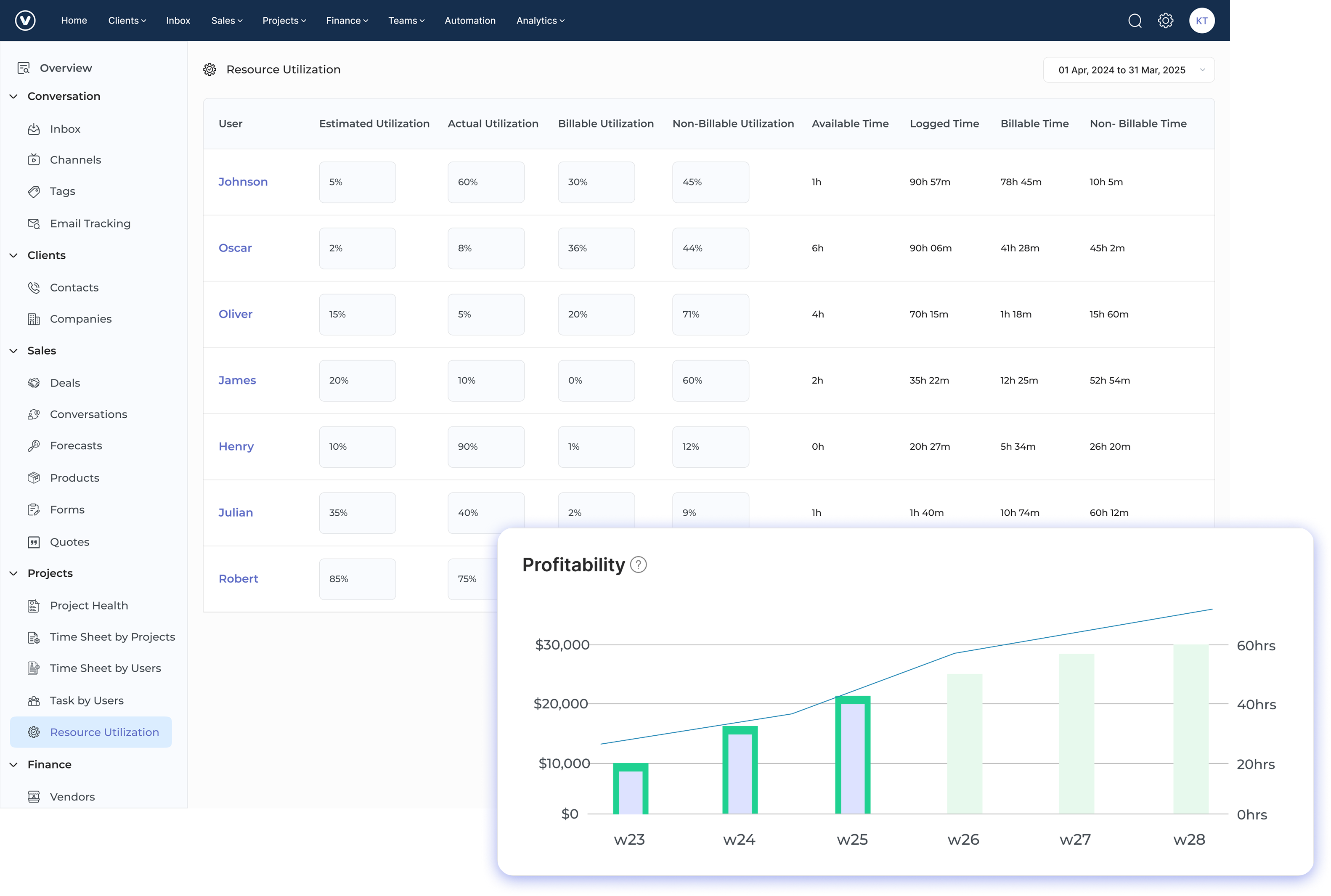
- Profitability dashboard: You get real-time insights into project finances. Kooper shows profit margins by comparing logged hours against budgets, so managers can catch issues early and keep projects on track.
- Resource planning: The dashboard shows team capacity with easy color-coded visuals. You can quickly spot who’s overbooked and who’s free to take on more work.
- Time tracking with budgeting: Team members log time against tasks, and Kooper updates project budgets as well as progress automatically.
- Custom workflows: You can build project templates with custom fields and approvals that match your agency’s processes, so your dashboards show exactly what matters to you.
Veemo Project
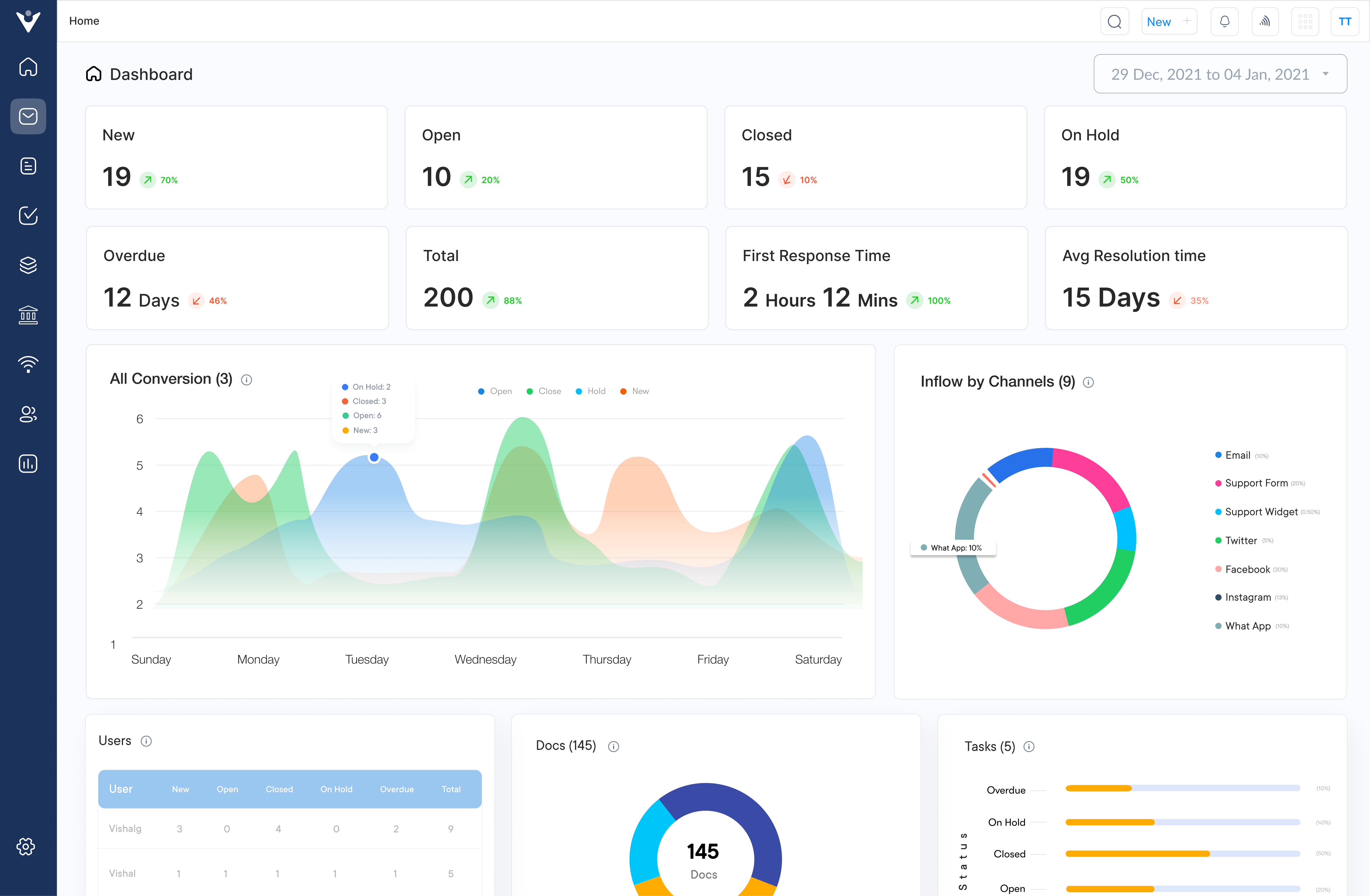
Veemo Project is a project management tool built with client-facing teams in mind. Its smart dashboards turn complex project data into simple, visual insights that are easy to understand and act on. What makes Veemo stand out? Its client portal keeps communication transparent, and its resource management tools help teams stay on top of multiple projects without burning out.
Veemo is perfect for agencies and professional service firms juggling several clients with limited resources. Its real-time dashboards show project profitability and how busy each team member is, so managers can quickly shift workloads, keep projects on track, while making sure no one gets overwhelmed. It helps you deliver on time, every time and without the stress.
Key features:
- Client portal: Client portal provides a dedicated dashboard where clients can view project progress, approve deliverables, and communicate with the team without seeing sensitive information related to internal operations or other clients.
- Resource management: The resource management dashboard visualizes team capacity across all projects with color-coded availability indicators that make it immediately obvious when team members are approaching overallocation.
- Financial tracking: The financial tracking feature includes project budget dashboards that display real-time profitability metrics by comparing billable hours against project estimates to identify potential issues before they impact margins.
- Task dependencies: The platform’s task dependencies system creates visual workflow maps in dashboard format showing how deliverables connect across projects so managers can see the cascading impact of delays.
Monday.com
Monday.com makes project management easy with its colorful, visual interface. It turns complex tasks into clear, easy-to-follow workflows using color-coded status updates and progress bars. The platform is great for teams of all sizes because its dashboards can be customized for each person, so everyone sees the info they need, while still staying aligned with the overall project goals. It’s a smart way to keep projects on track and everyone on the same page.
Key features:
- Drag-and-drop interface creates seamless workflow management experience.
- Custom automations eliminate repetitive tasks across project boards.
- Multiple dashboard views accommodate different management perspectives seamlessly.
- Colorful visual indicators make project status immediately apparent.
Hive
Hive is a project management solution with AI-powered features designed specifically for collaborative teams working across multiple projects simultaneously. Its dashboard capabilities excel at providing both high-level overviews for executives and detailed task tracking for project managers while integrating seamlessly with popular productivity tools.
Key features:
- Action cards track deliverables across different project views.
- Time tracking tools connect directly to billing systems.
- Proofing workflows streamline feedback on creative deliverables efficiently.
- Resource allocation tools prevent team member overload effectively.
Wrike
Wrike provides enterprise-grade project management with sophisticated dashboard capabilities that scale from small teams to multinational organizations without sacrificing usability. The platform is great at managing complex approval workflows and dependencies. It also offers customizable reports that can be tailored to fit different departments and organizational needs.
Key features:
- Interactive Gantt charts visualize dependencies across project timelines.
- Workload view prevents resource bottlenecks through capacity visualization.
- Custom request forms standardize project intake procedures effectively.
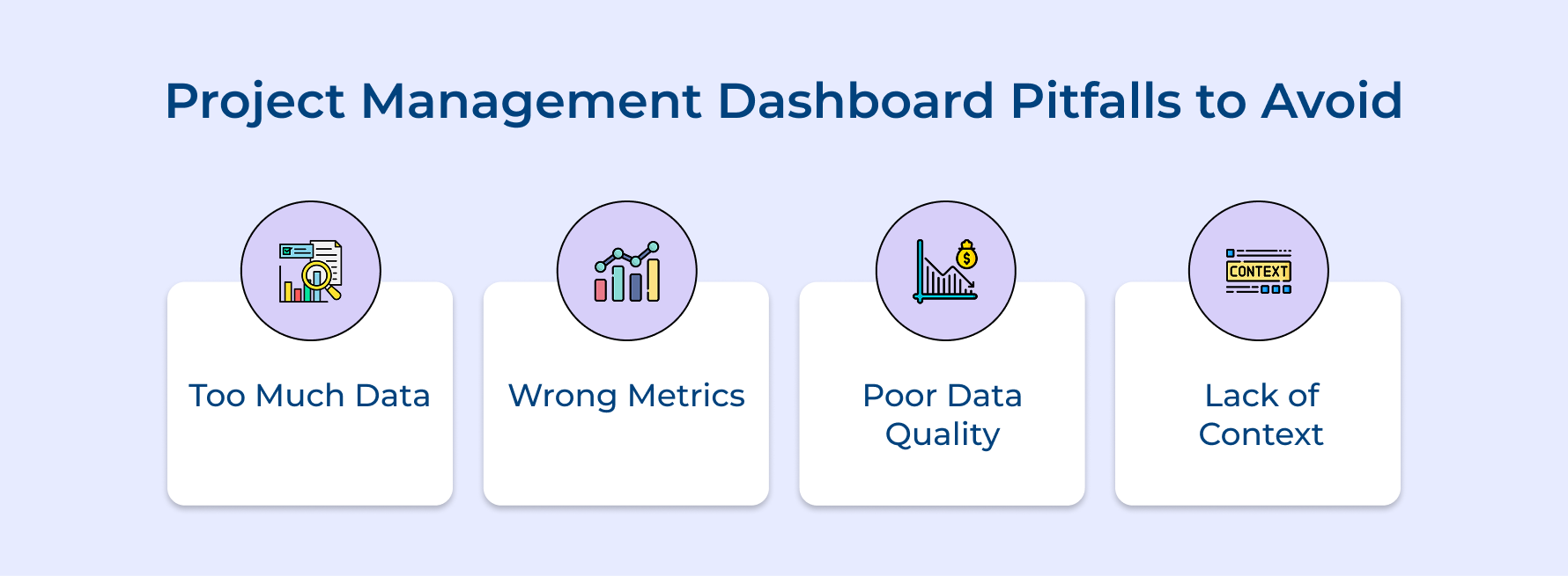
Common Project Management Dashboard Pitfalls to Avoid
Let’s explore the five common mistakes in creating and using project management dashboards, as well as how to avoid them to make dashboards effective tools.
- Too Much Data:
Adding too many metrics makes the dashboard cluttered and hard to read. It overwhelms team members and leads to missed warnings or abandonment.
- Wrong Metrics:
Tracking irrelevant metrics disconnects the dashboard from business goals. Teams waste time on data that doesn’t help decision-making and miss important insights.
- Poor Data Quality:
If data is unreliable, trust in the dashboard breaks. Inaccurate metrics lead to poor decisions and the team ignores the dashboard, relying on gut feelings.
- Lack of Context:
Showing raw numbers without context makes it hard to interpret. Without benchmarks or targets, it’s difficult to spot problems or trends.
Implementing thoughtful approaches to dashboard design and management can transform these potential pitfalls into opportunities for creating genuinely valuable visualization tools that enhance your project management capabilities and deliver measurable business benefits.
- Design role-specific dashboard views that show only the metrics relevant to each team member’s decision-making responsibilities.
- Begin each dashboard project by explicitly connecting every potential metric to a specific business outcome or decision it will inform.
- Implement automated data validation checks that flag potential quality issues before they reach the dashboard display.
- Include clear visual indicators like color-coding or icons that immediately signal when metrics fall outside acceptable thresholds.
- Schedule quarterly dashboard reviews to eliminate underused metrics and add new measurements that reflect evolving business priorities.
- Create a “dashboard champion” role who ensures data accuracy and helps team members interpret information correctly.
Manage Projects Effectively with the Right Dashboard
Project management dashboards transform scattered data into actionable insights that drive better decisions across your organization. When properly designed, these visual command centers illuminate project health at a glance while highlighting potential issues before they compromise deadlines or budgets. Thoughtful implementation aligns teams around common goals and ensures everyone sees the same project reality.
The journey toward effective dashboards requires careful planning, stakeholder input, and continuous refinement based on actual usage patterns. By choosing metrics that truly impact your business and displaying them clearly, you create a tool that boosts transparency, accountability, and project success across your portfolio.
Limit time — not creativity
Everything you need for customer support, marketing & sales.
Shivank Kasera is part of the marketing team at Kooper, where he focuses on building content that helps agencies and service providers grow. With a keen interest in SaaS, operations, and scalability, he translates practical insights into actionable resources for business leaders.
